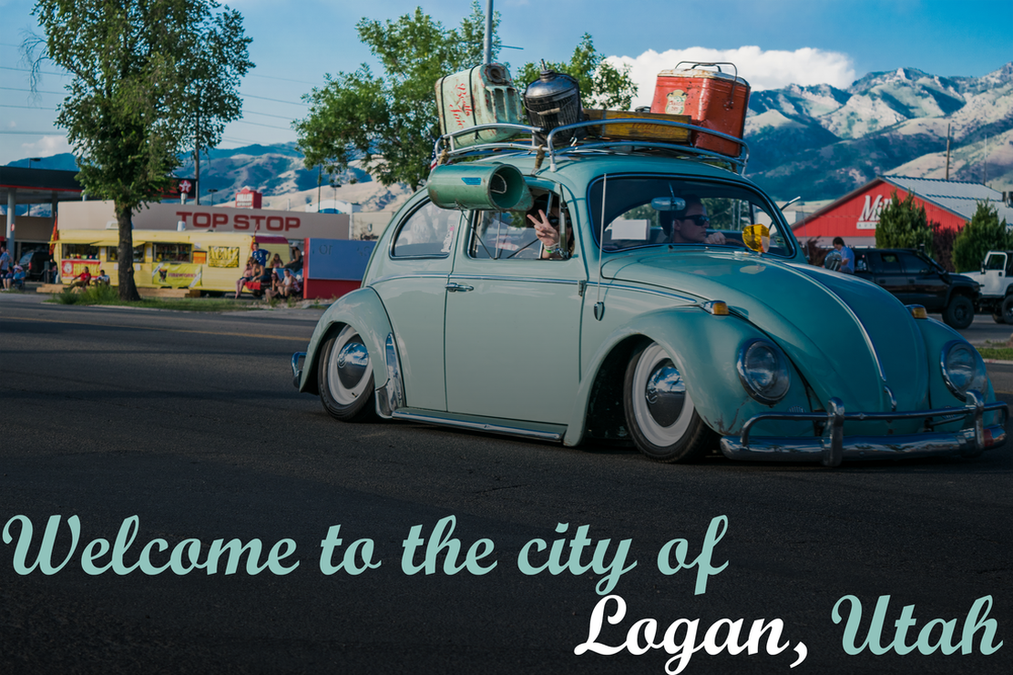
This is one of my favorite pictures I have taken. I brought up the bright colors in this picture to really make it pop. I brought the saturation up a little and the contrast up quite a bit to make it look like it was drawn. I copied the color of the car and I used it in most of the writing. I had one word be a different color to make it stand out. The car looks like it's about to drive off the picture. That is why I made the writing extend from one side of the picture to the other. Overall I am very happy with the way it came out.
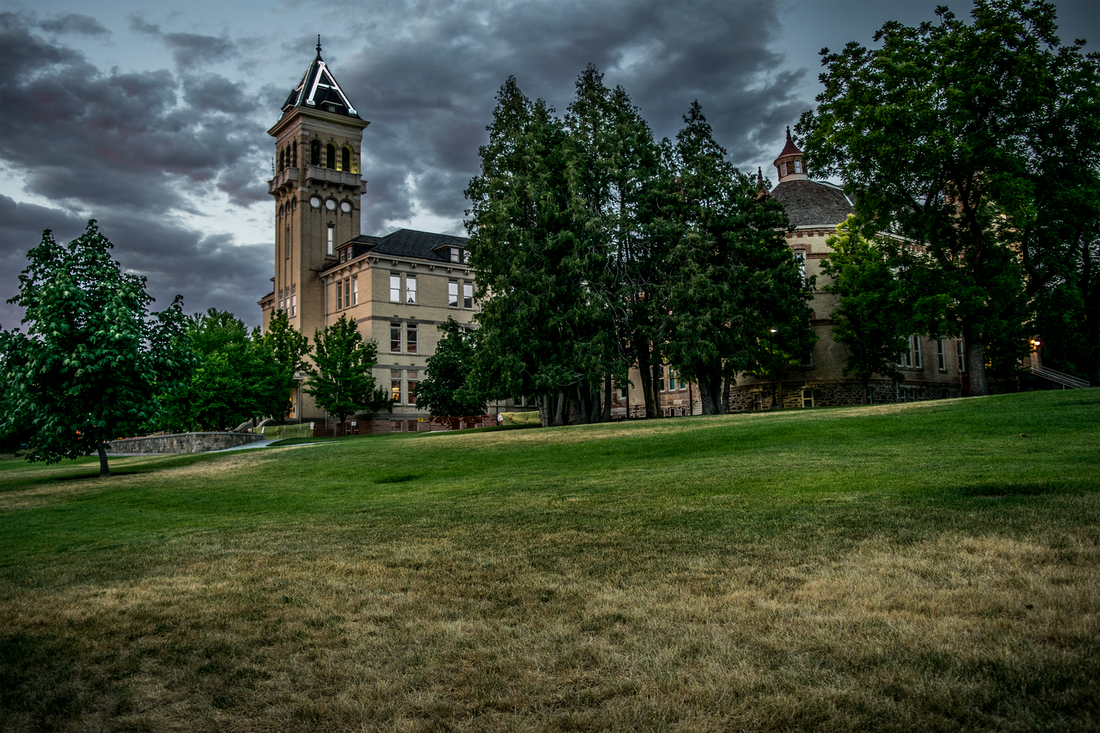
This picture has a special meaning in my life because I am truly happy with my life at the moment. I took this picture at around 6pm. This is a great time to take picture at. Like in many of my outdoor pictures, I tend to add a little more contrast than usual. I also brighten up the picture.
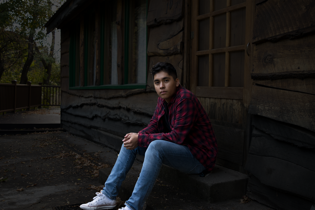
I was doing a photo shoot for one of my friends and I had him take this picture. I had originally turned in a different picture for this portfolio assignment but I didn't like my first submission so I made a better one. I first edited this picture in camera raw and made the background look amazing. I then went into Photoshop and turned the background black and kept my body the original color.
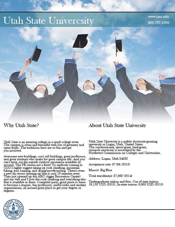
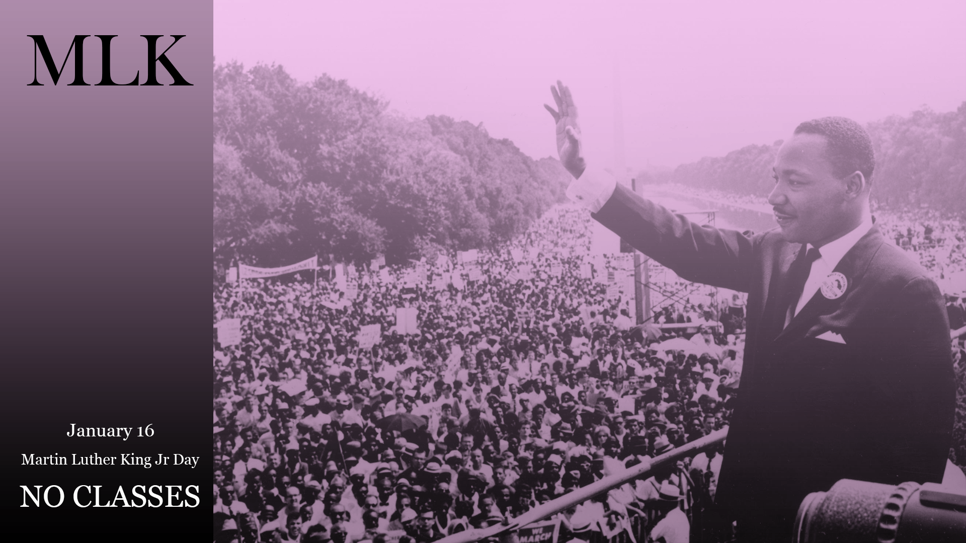
I am really proud of how this came out. I think it looks really professional. I looked at your example and I wanted to make something along those lines. I wanted to do a flyer on Utah State because it is the greatest school there is. I first looked for a picture the would fit in perfectly. I then added a blue box and brought down the opacity. I then added text. Then I looked for the Utah state emblem and added it to the bottom left to make it look like an official flyer. Last but not least I added the text in the middle from the wiki page . I took along time finishing this one but I'm proud!
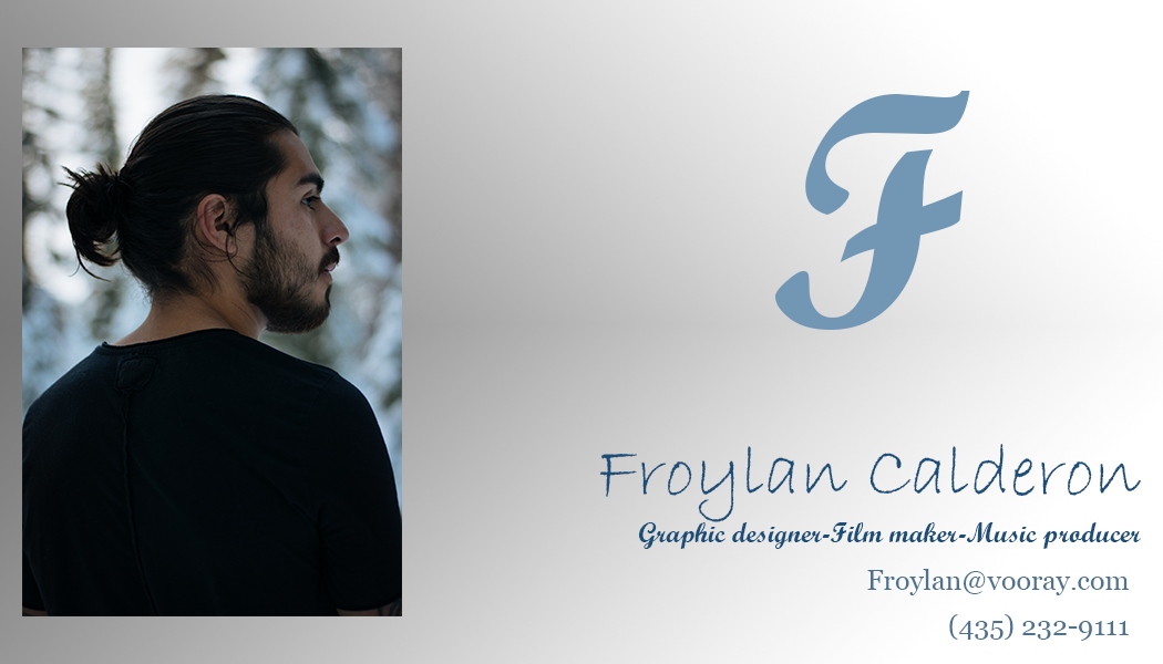
I really like it when a design looks really simple but really classy. That is what I try to do in all my designs. With this design, I added a picture that I took this past week. I don't have a good picture of myself so for now I'll post one of my friend. Editing this picture alone took me 30 min. I used 3 different color blues and 4 fonts to make it look a little different. I then finished it off with a gray gradient.
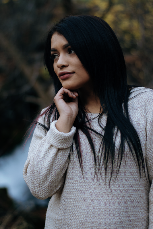
I took this picture this past week. I first brought this into light room to color grade it and just make it look amazing! After that, i took it into Photoshop and I began to take the hair out of her face. I then lighten up her face with the healing brush tool. The same tool i used to get rid of her hair on her face. I then started color correcting. I messed around with the curves tool and the vibrance tool and this was my final outcome.